
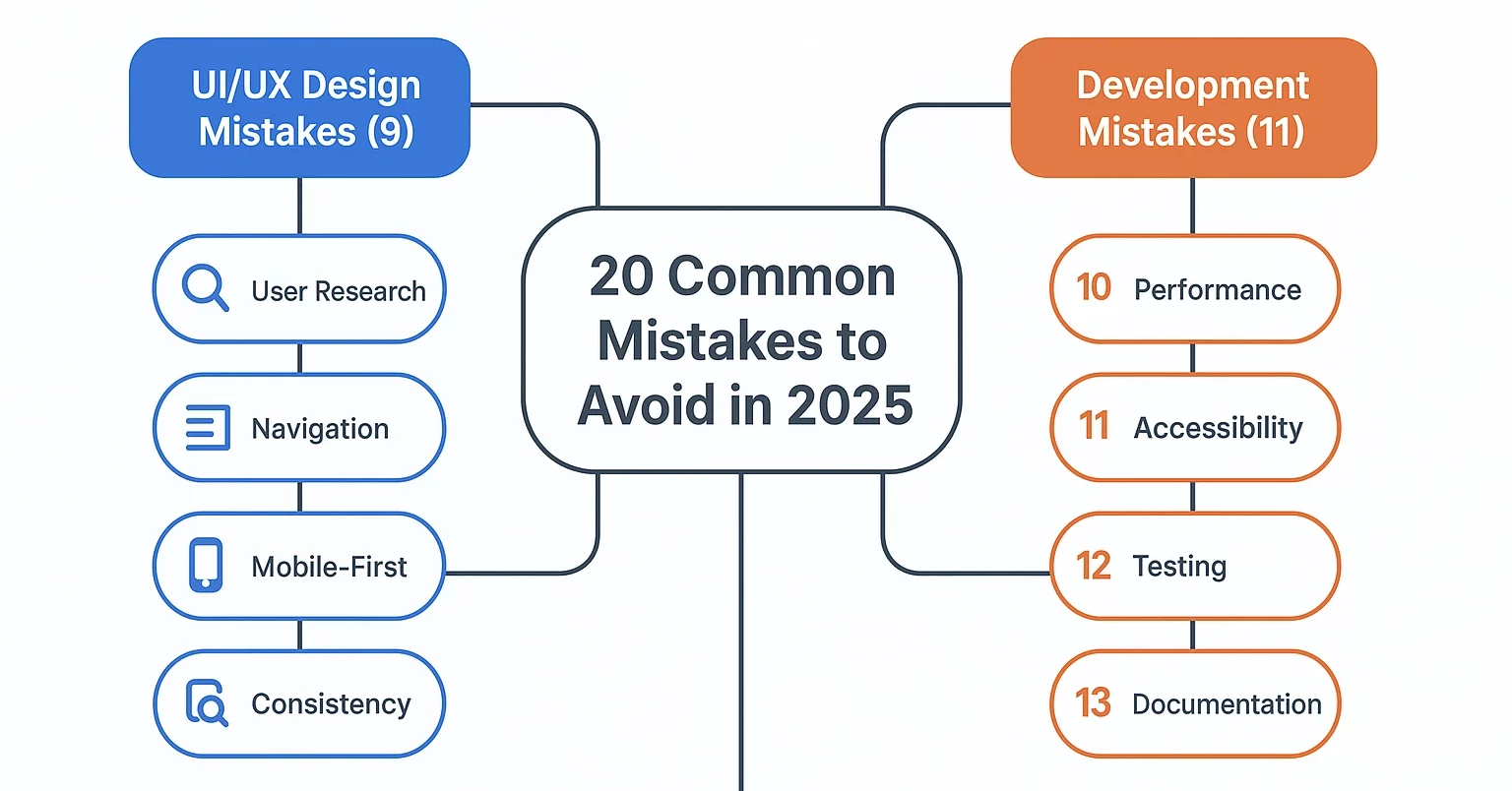
Designing a standout mobile app in 2025 requires flawless UI/UX and smart development practices. While innovation drives growth, common missteps – from ignoring user research to overloading features – continue to derail many projects. Let’s highlight what are the common mobile app development mistakes and what you must avoid to ensure your app succeeds.
Key UI/UX Design Mistakes to Avoid
Ignoring user research
User research is the foundation of great design. Without it, apps risk missing real user needs and expectations, leading to products that frustrate rather than help. Thorough research ensures you understand your target audience’s goals, behaviors, and challenges, which allows designers to build solutions that truly resonate. Skipping this step often results in wasted resources and features no one uses.
- Conduct surveys and interviews before starting design.
- Run usability testing at different stages.
- Align design decisions with real-world data.
Overcomplicating navigation
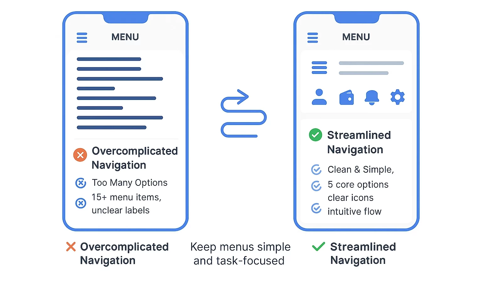
A confusing navigation structure not only frustrates users but also pushes them to abandon the app altogether. When navigation is cluttered or unintuitive, users spend more time searching than completing tasks. A clear, streamlined structure ensures that users can move seamlessly, boosting satisfaction and retention.
- Keep menus simple and intuitive.
- Use familiar icons and labels.
- Limit the number of clicks needed to reach core features.
Neglecting mobile-first design
Designing with desktop in mind first often overlooks how people actually use apps—on smaller screens and on the go. A mobile-first approach prioritizes responsive layouts, touch-friendly interactions, and performance on limited bandwidth. Ignoring this perspective can alienate mobile users, who now form the majority of digital audiences.
- Prioritize responsive layouts for small screens.
- Ensure touch targets are large and accessible.
- Optimize loading speed for mobile networks.
Poor visual hierarchy and imbalance
When users can’t easily identify important elements, they become confused and disengaged. A weak visual hierarchy causes frustration and reduces the effectiveness of calls-to-action. Establishing balance with contrast, size, and spacing directs attention where it belongs, leading to smoother interactions and stronger engagement.
- Use contrast and typography to guide attention.
- Apply spacing and alignment for clarity.
- Highlight key actions with distinct buttons.
Inconsistency in design elements
Inconsistent design erodes trust and makes the product feel unpolished. If fonts, colors, and button styles vary without logic, users perceive the app as unreliable. Consistency, on the other hand, builds familiarity and confidence, creating a seamless experience that strengthens your brand’s credibility.
Standardize fonts, colors, and button styles.
Use a design system or style guide.
Ensure consistency across platforms and devices.
Overloading content or font styles
Bombarding users with excessive text, images, or font variations can quickly overwhelm them. Too much information at once makes comprehension harder and diminishes readability. Clean, concise layouts with controlled styles improve communication and keep users focused on the most important content.
- Stick to a limited set of fonts and weights.
- Break long content into digestible chunks.
- Use visuals only when they add value.
Neglecting accessibility
Excluding accessibility considerations means leaving out a significant portion of potential users, including those with visual or physical impairments. Accessible design not only broadens your audience but also ensures compliance with regulations and enhances overall usability. Apps that prioritize inclusivity demonstrate social responsibility and create lasting value.
- Maintain proper color contrast.
- Add alt text for images.
- Support screen readers and keyboard navigation.
Bombarding with pop-ups
Intrusive or frequent pop-ups break user flow and damage trust. Users often abandon apps that feel overly aggressive in demanding attention. Pop-ups should be minimal, purposeful, and respectful of user time, ensuring they provide value without compromising the overall experience.
- Use pop-ups sparingly for critical actions only.
- Ensure they’re easy to close.
- Avoid interrupting core tasks unnecessarily.
Prioritizing aesthetics over functionality
While visual appeal is important, design must always serve usability first. A sleek interface that hinders core tasks will ultimately fail. True success comes when aesthetics and functionality work together, providing both an attractive look and a seamless path for users to achieve their goals.
- Balance visuals with usability.
- Test whether designs enhance user goals.
- Focus on clarity and functionality first.
Common Mobile App Development Mistakes
Skipping proper research & due diligence
Jumping into development without researching frameworks, tools, or team capabilities can lead to costly setbacks. Careful due diligence helps identify risks, validate feasibility, and avoid misalignment with long-term goals. Taking time upfront ensures the foundation is strong before significant resources are committed.
- Evaluate frameworks and technologies before adoption.
- Vet partners, vendors, or teams thoroughly.
- Conduct competitor and market analysis early.
Not identifying core app purpose
When the central purpose of the app isn’t clear, features and design become scattered. A well-defined purpose anchors the project, guiding decisions on design, functionality, and priorities. Without clarity, the product may feel confusing and fail to meet user expectations.
- Define the primary problem your app solves.
- Create a concise vision statement.
- Align every feature to the app’s main objective.
Attempting perfection in the first version
Striving for perfection in the initial release can delay launches and burn resources. Apps evolve best through iterative updates where user feedback guides improvements. Over-polishing early versions increases costs and can miss the chance for valuable insights from real users.
- Release an MVP to validate assumptions.
- Use feedback loops to refine features.
- Improve gradually with updates.
Adding too many features too soon
Overloading the app with features from the start can confuse users and strain resources. Prioritization ensures the most impactful functionality is delivered first, keeping the experience simple and engaging. Too many features also complicate testing and maintenance.
- Focus on essential features for launch.
- Maintain a feature roadmap for growth.
- Regularly assess feature usage to trim excess.
Building for too many platforms initially
Targeting multiple platforms from day one stretches resources thin and complicates quality assurance. Focusing on one platform first allows for stronger validation and refinement. Once success is proven, expansion to additional platforms becomes smoother and more cost-effective.
- Choose the platform most aligned with your audience.
- Test extensively on the chosen platform.
- Plan expansion after validating product-market fit.
Insufficient testing
Skipping robust testing exposes users to bugs and poor experiences. Thorough QA ensures performance, security, and usability are reliable across devices. Continuous testing builds trust and reduces costly post-launch issues.
- Implement automated and manual testing.
- Test on multiple devices and environments.
- Conduct usability testing with real users.
Ignoring user feedback
Dismissing feedback prevents the app from aligning with real-world needs. Gathering and analyzing user input provides insights that shape better features and experiences. Ignoring this step risks alienating your audience and missing opportunities for improvement.
- Collect feedback through surveys and in-app prompts.
- Analyze patterns in complaints or suggestions.
- Act on recurring feedback quickly.
Poor communication during development
Miscommunication among developers, designers, and stakeholders leads to wasted time and mismatched expectations. Clear collaboration keeps projects on track and aligned with goals. A culture of transparency reduces delays and ensures everyone works toward the same vision.
- Use collaboration tools for transparency.
- Schedule regular progress check-ins.
- Document decisions and share updates consistently.
Treating the app like a website
Designing an app as though it were a website can compromise the mobile experience. Apps must embrace native functionality, gestures, and offline usability. Copying web layouts often ignores mobile context, resulting in clunky interfaces.
- Leverage platform-specific UI patterns.
- Optimize for touch interactions and gestures.
- Provide offline capabilities where possible.
Neglecting performance and optimization
Performance issues like slow load times and crashes severely damage trust. Optimized code and efficient backends ensure smooth user journeys. Ignoring performance may cause abandonment and negative reviews.
- Minimize app load times.
- Optimize backend queries and processes.
- Monitor performance with analytics tools.
Ignoring security and platform guidelines
Weak security practices and non-compliance can lead to breaches or app rejection. Protecting user data and following platform requirements safeguards reputation and functionality. Prioritizing security from day one avoids costly damage later.
- Encrypt sensitive data at rest and in transit.
- Follow iOS and Android policy requirements.
- Conduct regular security audits.
Conclusion About Common Mobile App Development Mistakes
In 2025, delivering a successful app depends on balancing thoughtful design with disciplined development. Avoiding the pitfalls outlined above means prioritizing clarity, usability, and performance at every stage. Start with a clear vision backed by user research, build lean with a focus on core functionality, and evolve through continuous feedback and testing. Combine this with secure coding, strong communication, and platform-appropriate design to create an app experience that not only delights users but also earns long-term trust in a competitive market.